I have 20+ years of experience in Graphic Design and Advertising Art Direction in print, digital and interaction projects. I use a mix of technology, craft, experience and creativity to get results in the AI and Data era.
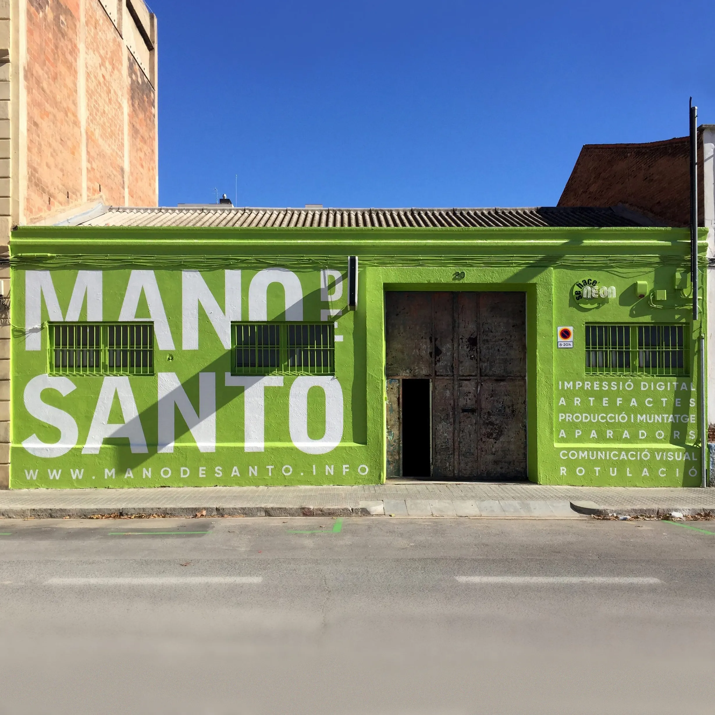
From plain white to bold branding, a few days of paint turned Mano de Santo into a local landmark that started bringing in walk-in clients.
When I joined Mano de Santo, the workshop already had a solid reputation in the film and advertising world in Barcelona, but as a whole the brand was visually a chaos. It was little more than a logo, floating around without rules or direction.
Over the next six years, while managing a steady flow of client projects, I worked on turning that logo into a cohesive identity and giving the company a proper brand structure. What began as a clean-up job evolved into a full-scale transformation that reshaped how Mano de Santo looked, spoke, and even how it showed up in the city. From the website to the shopfront, everything was reimagined to reflect the spirit of the team: bold, adaptable, and a little mischievous.
As Head of Art, I wore every hat imaginable: designer, strategist, writer, manager, and product designer. I wrote the company ethos, designed the system, structured the website, and shaped a brand personality that better represented our work and helped attract stronger clients. Along the way I directed all in-house design, managed freelancers, collaborated with production leads, and helped leadership define what Mano de Santo stood for: fearless commitment to efficiency, sharp craft, and no unnecessary fluff.
The website was the first thing I tackled. The old one, due to poor management, had gone offline and was impossible to recover, so I created a new version from scratch. I wrote the copy, designed the UX and UI, and built a flexible system that could grow with the brand. It quickly improved our digital footprint and visibility, generating up to 40% of new leads. It was something the company had clearly been missing.
The next step was the facade. The workshop’s plain white exterior blended into the street, and I wanted to make a bold statement to increase local visibility. We painted the building in our signature colour and covered it with a giant white wordmark I created as a secondary logo. Suddenly it was impossible to miss Mano de Santo. People started taking photos. Locals used it as a point of reference. It became a physical extension of the brand’s confidence and personality.
From there, the visual system expanded naturally. I created most of the assets that make a brand feel real: stationery, invoices, quotes, stickers, T-shirts, and social media avatars. Every piece followed the same logic: functional, bold, and full of character. Nothing was decorative. Everything had purpose.
One of the main challenges I faced while managing the brand was how to give structure to a company that does so many different things and isn’t afraid to diversify. After a long time trying to make everything work under one name, it became clear that creating new brands for different purposes was the best way forward. I designed two to start with: one for a production-space rental service, and another for signage and retail design projects. Each has its own voice and look, giving us flexibility to experiment and scale without losing coherence, while allowing us to reach new audiences more effectively.
Today, Mano de Santo is more than a production workshop. It is a brand that speaks for itself: strong, bold, and adaptable. The website continues to bring in new clients, the facade has become part of the neighbourhood’s visual culture, and the design system keeps evolving with every project.
It was a long, ongoing act of creation. A living identity shaped over time, built from the inside out, and still growing, but now with a strong foundation.
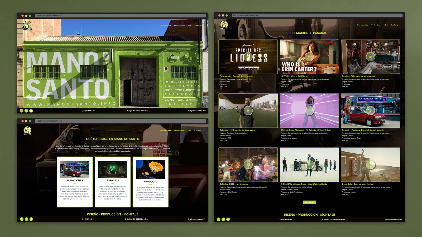
Some of the screens from the current website, bringing order and clarity to present the company’s services with a straightforward voice.
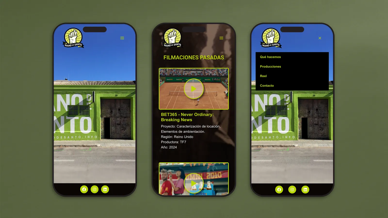
Designed for everyday use, the mobile version keeps the same energy and direct tone, just pocket-sized and ready to visit anywhere by our clients.
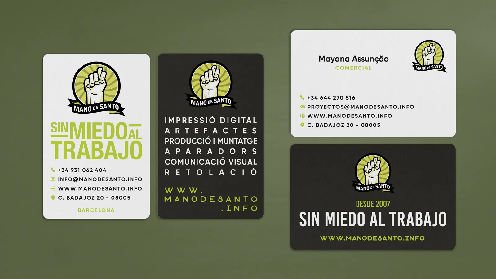
Two different designs for different moments: an unapologetically bold version for the studio, and a leaner one for front-facing staff who need a small piece of identity that does what it should.
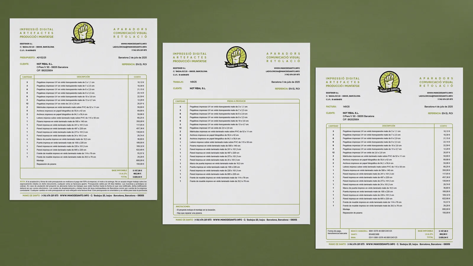
A complete makeover of the stationery and paperwork to extend the brand into every detail and make even the boring stuff feel considered.
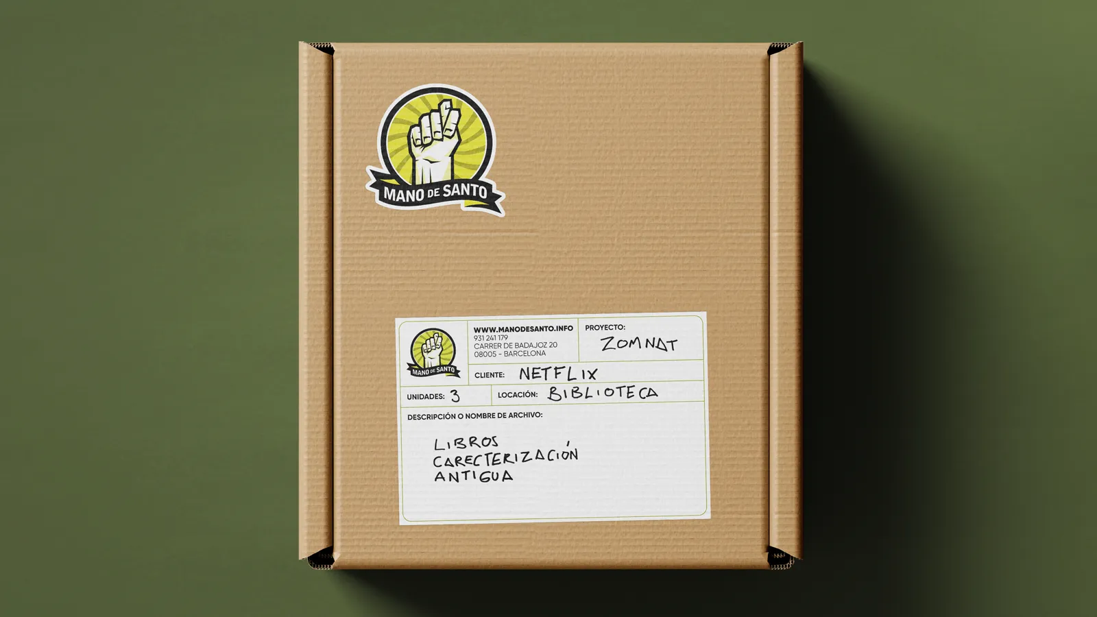
An essential part of our production flow. This label ensures every item reaches the right hands fast and clearly communicates what’s inside. A practical piece of branding made to travel.
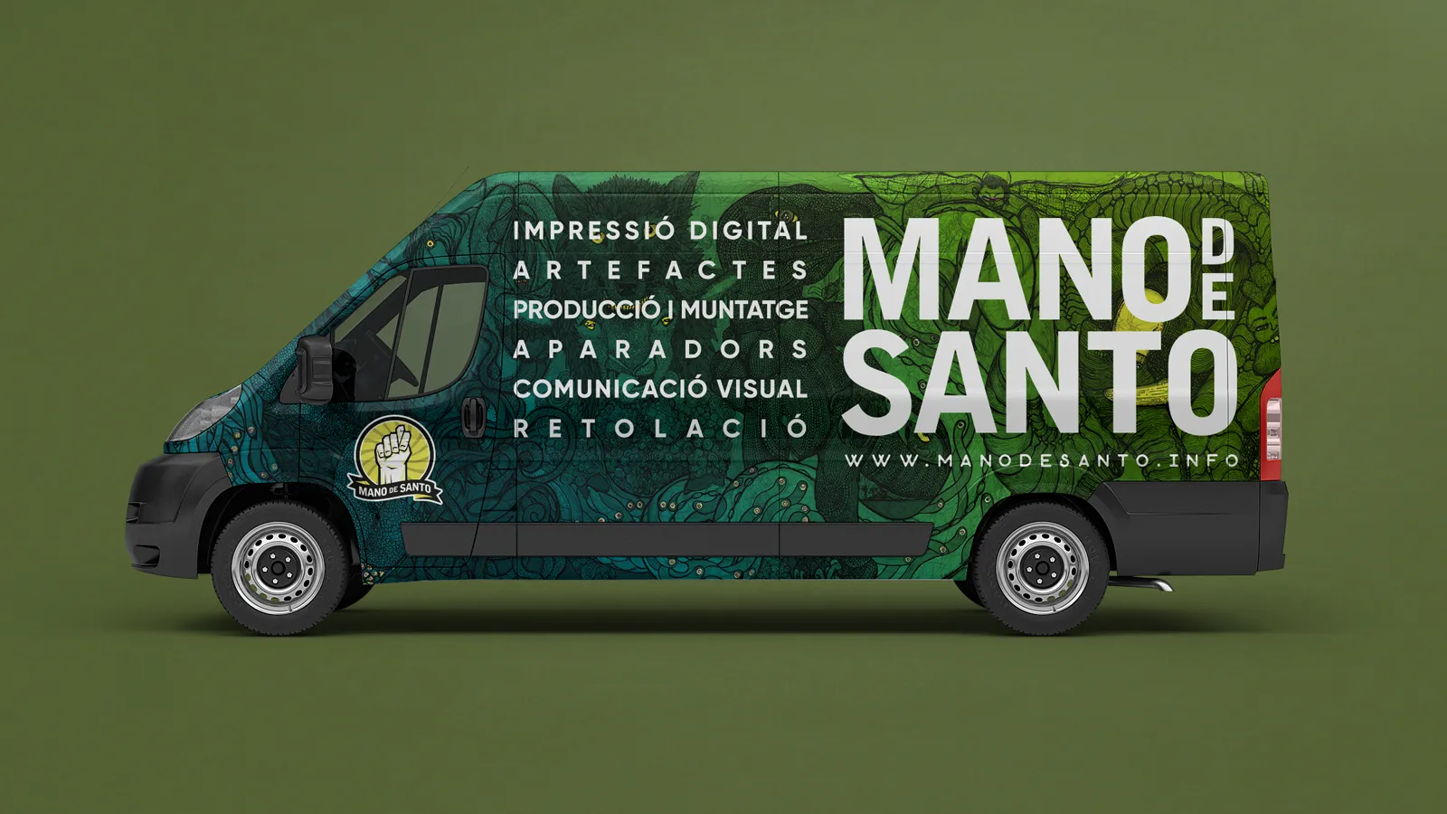
As part of the brand activation strategy, we periodically changed the vehicle graphics. This is one of my favourite iterations, using one of the owner’s own illustrations as background.
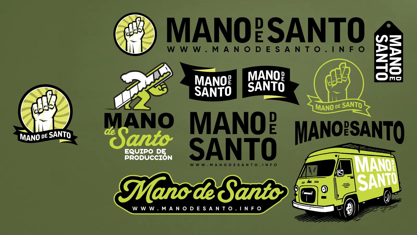
The original logo was too limiting for modern use, so I expanded it into a flexible system. A family of marks built for motion, growth, and adaptability across any medium.
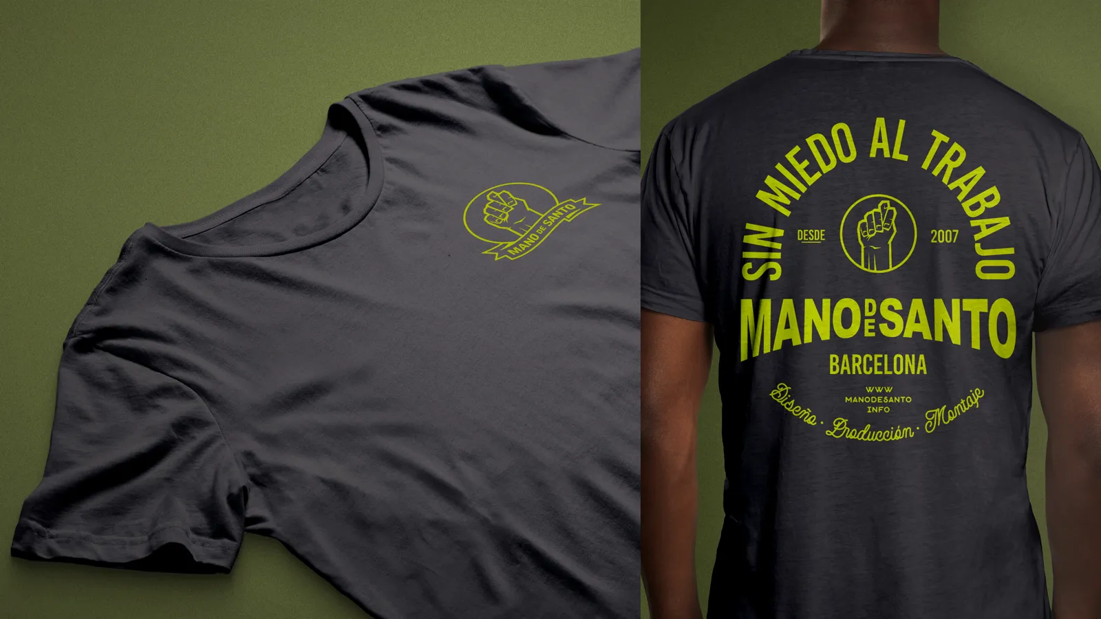
Like the vehicles, our team T-shirts changed over time. This is one of the latest designs I created, inspired by vintage biker garage tees.
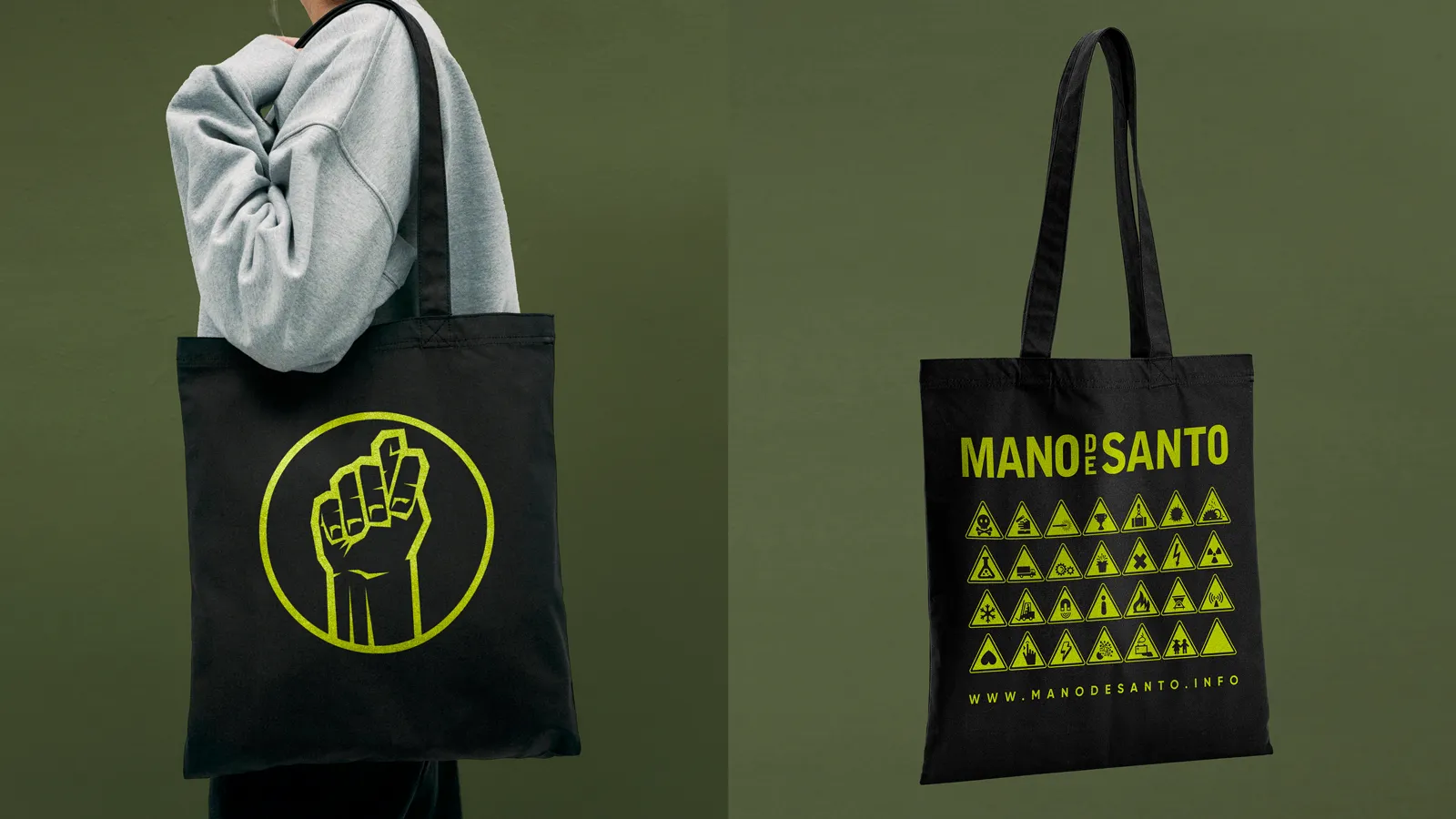
Every year we design a small set of gifts for our most valued clients. The cotton tote has become a favourite among recipients: functional, local, and made to last.
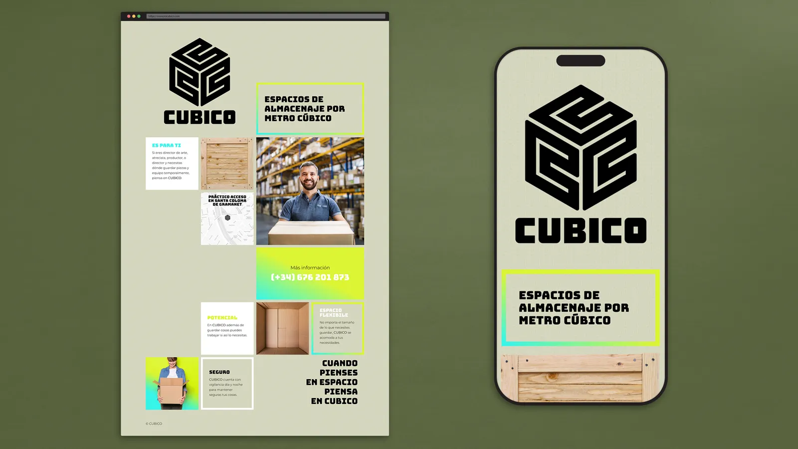
As part of our brand reorganisation, we created CUBICO, our production and storage brand. The landing page was built with a clean identity while we developed the full user platform.
Continuing with the brand reorganisation, we created LETREROS BARCELONA, a signage and commercial spaces brand. This is the landing page while the e-commerce site takes shape.
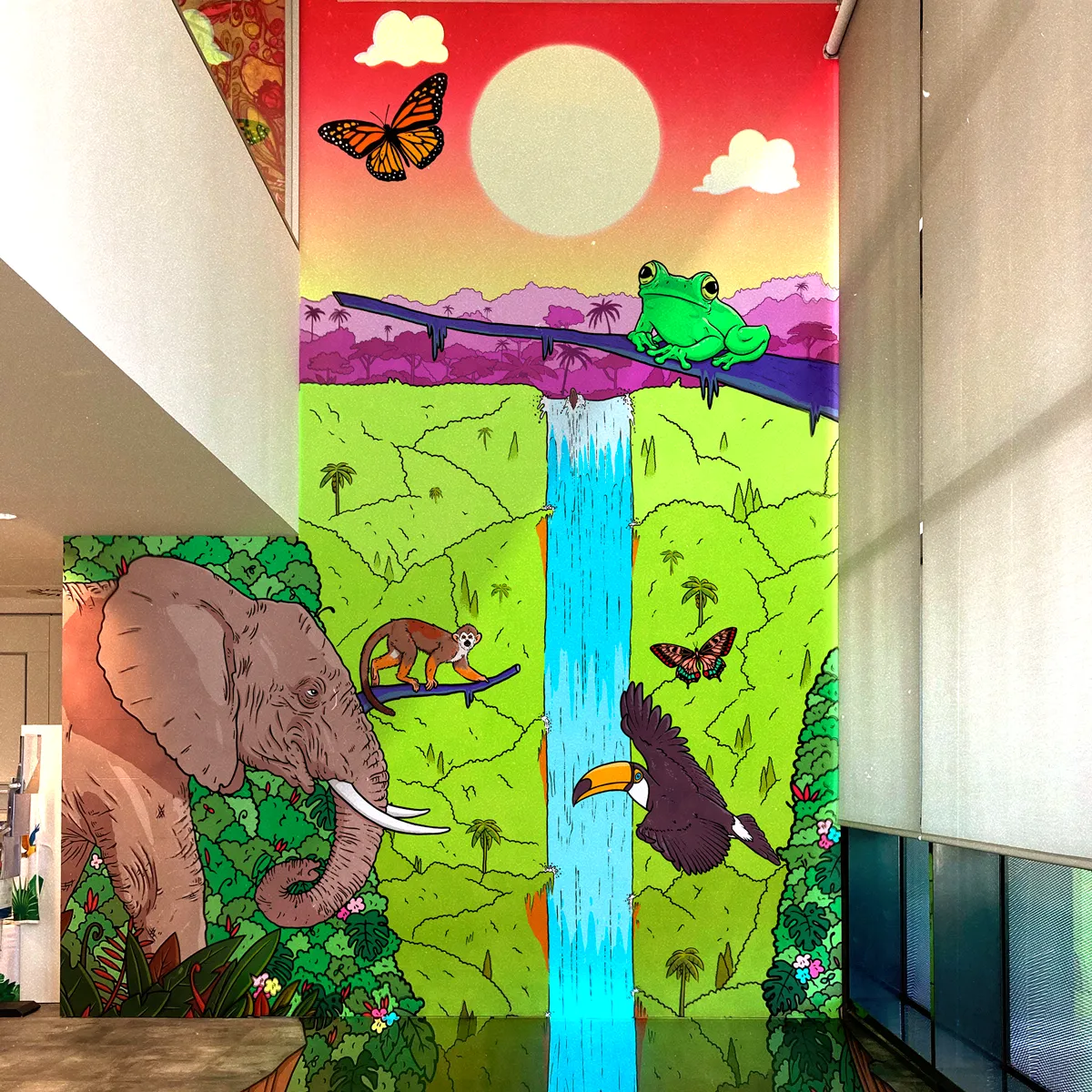

The final mural seen from the right spot, showing the optical effect of the cascade dropping below the floor.
EPSON Ibérica, Epson’s headquarters for Spain and Portugal, has been one of Mano de Santo’s long-time clients and partners. One day they came to us with a challenge that several design studios, and even my boss, thought was impossible to achieve in the available space.
In the centre of their showroom stood a massive wall that had displayed the same graphic for years, and they wanted to replace it with something new and unforgettable. Their idea was to create one of those optical illusions that, when viewed from a precise spot, would appear three-dimensional. Specifically, they wanted a waterfall that seemed to cross the floor below. To make it even trickier, the new piece needed to visually connect with a jungle-themed video mapping they had recently produced for an event that year.
Although I had never created something in that style before, I was confident the effect could be achieved in that space. We just needed to find a focal point with enough room to build the illusion and let the perspective do its thing. I began by measuring the room and figuring out a comfortable place where a viewer could experience the effect. With that, after several sketches, small-scale models, and perspective tests, I built the final composition that allowed me to begin the final illustration.
Since the artwork would be the main feature of the showroom, it had to look perfect from every distance. I worked at an extremely high resolution to ensure there was no room for pixelation or error. As it was also going to be printed on an EPSON plotter, it needed to look flawless to demonstrate the capabilities of their equipment.
Halfway through the process, the client asked if instead of just taking inspiration from the video mapping, we could adapt it directly to the design so they could also highlight one of their new projectors. The original studio kindly shared the files, and I reworked the animation so that my artwok became the new canvas for the projection. The result was a single cohesive piece where illustration and motion blended smoothly.
From the first conversation to the final installation, the project took around three months. I was in charge of the entire process, from concept to illustration and from production to installation, making sure every detail worked exactly as planned.
The result was an immersive mural that combined art, technology, and precision. A three-dimensional illusion that transformed the showroom wall into a living experience, showing what can be achieved with creativity and the capability of EPSON products.

Hand measurements and an early sketch to plan the project. This helped define the space and work out the perspective available to create the illusion.

The illustration in three stages of the creation process. Pencil, ink, and colour, built to hold detail at every distance.
Tightening the composition by moving the elephant closer to centre. And on the right, how the artwork was divided into sections for printing.

Different stages of the installation of the illustration across the wall and floor of EPSON’s showroom.

The finished piece. The centre image includes one of the installers to show the scale of the mural.
A mock-up video showing how the mural works with the adapted jungle mapping.
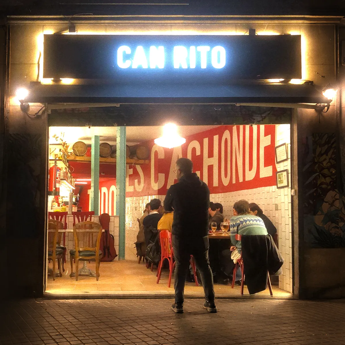

People enjoying conversation on Can Rito’s terrace.
The stakeholders were planning to open a restaurant near the Mercado de Sant Antoni in Barcelona, a very well known area for food lovers in the city. They wanted to serve traditional Spanish cuisine with a different flair, since both owners came from Latin American backgrounds. I joined the project early and helped them create the brand and personality for their new restaurant.
We began with the name. Since this was a passion project, I encouraged the couple to come up with it themselves rather than me presenting a list. I asked them to think about what would make their restaurant different from others serving similar dishes, and what personal meaning they wanted behind it. After a few rounds of name ideas and conversations, they arrived at two candidates, one I no longer remember and another called Can Rito, which they initially discarded. They felt it was not correct because it mixed languages and they believed the name should be entirely in Catalan.
When I asked where the name came from, they told me about a long conversation they had at home. They spoke about why they loved food, how meals felt when they were growing up, and how cooking felt like a ritual. In Catalan, “Can” means house and is commonly used in restaurant names. I told them they had already found their name. The mix of languages reflected who they were, a combination of cultures and ideas. Can Rito captured that perfectly.
With the name in place, I began working on the visual identity and looked for ways to bring together traditional inspiration with a contemporary twist. For the main logo, I drew from modernist emblems found in the industrial history of Barcelona, looking for a balance of forms that paid respect to the city’s past while still feeling modern and timeless. As a secondary mark, I created a heavy wordmark that was strong, easy to read, and adaptable for everyday use. It allowed the branding to scale in practical and economical ways.
I defined the brand using four colours: black, red, gold, and teal. Each area of the restaurant used a primary colour, with black for the terrace, red for the front room, and teal for the back. This approach influenced everything we designed, including the website, menus, printed materials, and online content.
Typography was a key part of the concept. I was inspired by transport signage from one of the owners’ home countries, and created a bold and playful typographic style. I also designed a custom Typography for titles and signage to reinforce this character throughout the space.
I built the website with the same ideas, and spent considerable time working on the menu structure. One of the owners regularly adjusted prices and dishes, so I created a simple backroom tool that allowed them to update the online menu easily without needing technical knowledge. This reduced friction and made changes quick to publish.
I also created a range of graphic pieces for the interior, including wall menus for the front, a wine menu for the back room, and a large hand painted typographic mural after a second renovation. When the owners started hosting small concerts, I designed a poster template so they could promote events consistently and stay on brand.
The reaction to the restaurant and its brand design was immediate. Can Rito became a small local hit, with positive reviews about both the food and the atmosphere. The bold visuals turned the space into a place people wanted to be seen in, especially in front of the “TODO ES CACHONDEO” mural that I designed, which quickly became one of the most photographed spots in the restaurant.
It was a complete identity built from a personal story. A house of ritual that brought together two cultures and turned a simple idea into a real destination in the neighbourhood.

The main logo, influenced by modernist emblems and the industrial history of the city. I tried to balance tradition with a more contemporary feel.

A secondary typographic logo created to be strong, readable, and easy to use in everyday situations.

Can Rito Serif, the typeface I designed for the restaurant, inspired by transport signage from one of the owners’ home countries.

Different views of the facade during the day and at night.

The original wall menu design. It worked at first, but as the menu grew it needed to be replaced with something more flexible.

The wine menu in the back room, built using different frames and pieces of wood. A functional menu that also works as part of the decoration.

A detail of the decorative border in the back room, using a poem written by one of the owners as part of the restaurant’s visual language.

The “Todo es cachondeo” mural in the main room. It became a focal point almost immediately and one of the most photographed spots in the restaurant.

T-shirt designs for the team uniforms.

The business card design, consistent with the rest of the brand.

Posters created from a flexible template to promote the weekly concerts hosted at the restaurant.

The website on desktop, showing the front page and the full menu.
The mobile version of the website. Same content, adapted for smaller screens, as this was the main usage.
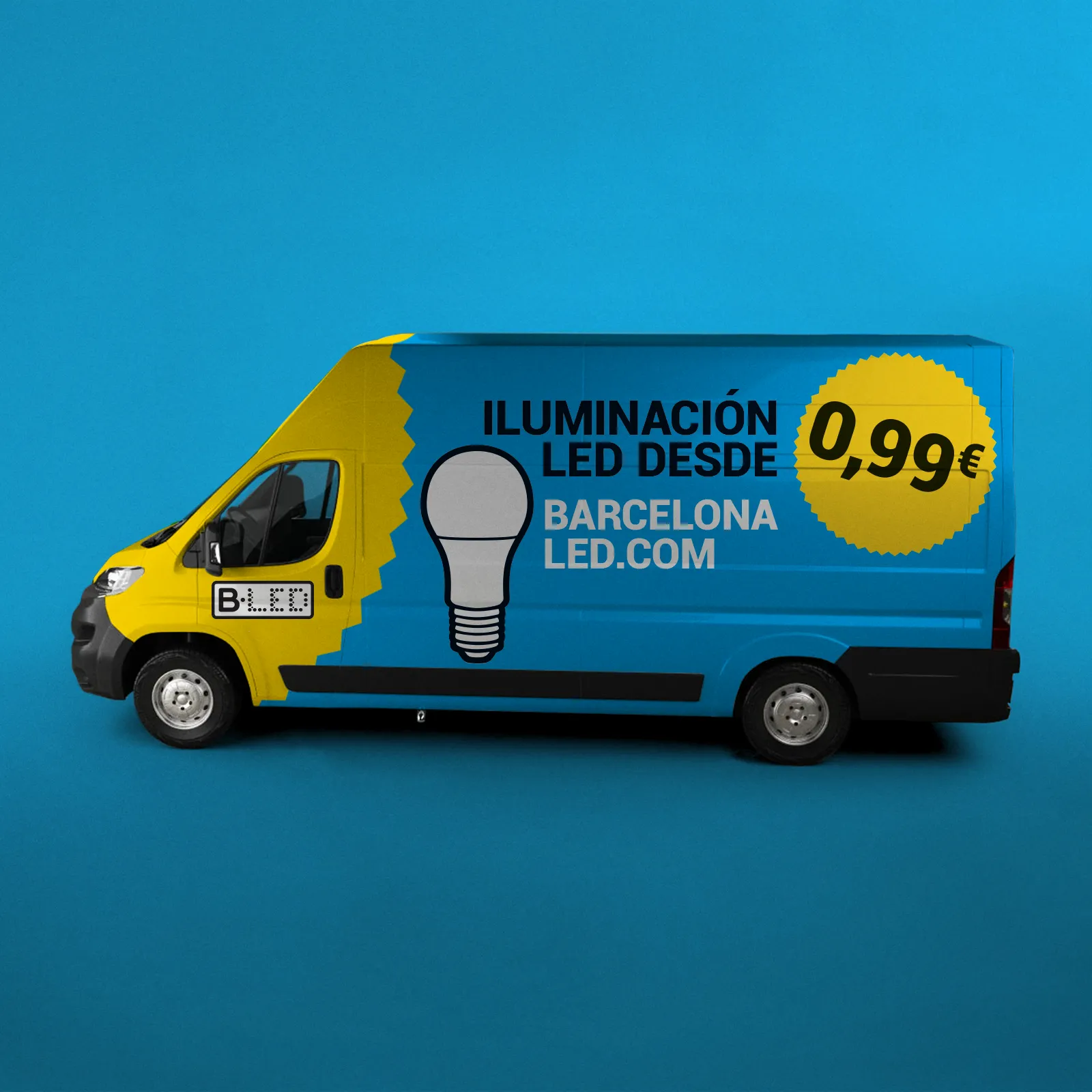

One of the designs created for the company’s delivery trucks. The bold colours and direct promotional message turned an everyday working vehicle into a moving advert for the brand.
When I joined Barcelona LED, the company was a growing importer and distributor of LED lighting products in Barcelona, with a wide catalogue covering home, industrial, and outdoor use. They operated several physical stores across Catalonia and two e-commerce platforms, one for the Spanish market and another for France. What they lacked was a unified visual direction that could properly support that scale.
I was hired as Head of Art, working directly with the marketing director. My role covered brand maintenance and development, the design of all physical stores and events, promotional materials, vehicle branding, and the UX and UI of both e-commerce platforms. I was also responsible for the design and ongoing maintenance of packaging for a catalogue of more than 3,000 products.
Beyond design execution, I worked closely with suppliers at every level. I managed and developed packaging with manufacturers in China, coordinated local and international production partners for all printed materials, and collaborated directly with the e-commerce development teams based in India. This required constant alignment between brand, production, and technical constraints, while maintaining consistency across every touchpoint.
One of my main challenges was consolidating the brand image. Before my arrival, many decisions had been made in isolation. I reviewed what existed, identified inconsistencies and errors, corrected them, and unified the entire product line under a coherent visual system. This meant standardising packaging across thousands of SKUs, aligning in-store displays, exhibition systems, company vehicles, and promotional landing pages under a single brand logic.
At the same time, I worked closely with the marketing team on social media assets, banners, printed advertising, and campaign visuals. The goal was not just to make things look better, but to make the brand easier to manage, scale, and trust.
On the digital side, I led the UX design of the e-commerce platforms, including a complete redesign of the checkout flow. One of the main objectives was to reduce cart abandonment. I worked on a new purchase loop focused on clarity, speed, and confidence, improving the overall buying experience for both markets.
I also focused on building and preparing a solid design team. I onboarded and trained new designers, provided ongoing coaching, and helped define workflows and responsibilities. The aim was to prepare the team to handle the growing demands of a brand moving towards maturity and a more structured organisational model.
Over time, Barcelona LED became a more cohesive and manageable brand. The systems put in place helped bring order across retail, packaging, and digital platforms, creating a clearer structure that could support scale. That foundation brought clarity to a complex catalogue and allowed the brand to keep moving forward with a stronger and more consistent framework.

Creating a standardised label system for the LED strip range was an interesting challenge. A large amount of technical information varied from one product to another, so everything needed to remain clear, easy to understand and consistent across hundreds of similar products.

The packaging designed for one of the company’s main light bulb ranges. The system needed to adapt to several models, wattages and colour temperatures while still looking like one family.

Some products came in very different formats and sizes, so we needed to create something easy to adapt and scale. The result was a flexible structure that could work across products with very different shapes and proportions.

The packaging designed for one of the industrial UFO lights. The bright yellow made the product easy to identify while leaving enough space for all the technical information and remaining consistent with the overall brand design.

One of the first things I did while restructuring the brand was look for a way to reduce costs and bring more consistency across all its communications. I selected an illustrator with a large stock portfolio and a style that could be adapted across different campaigns and materials.

The compostable shopping bags created for the physical stores. We were among the first retailers in Barcelona to replace conventional plastic bags with more responsible materials.

The business card design created for the company’s management team, store managers and sales staff, keeping the information simple, playful and consistent with the rest of the brand.

Graphics designed to present and compare different industrial lights inside the stores. The layout helped organise the main specifications and made the differences between products easier to understand.

A complete background wall designed for the industrial lighting area. It brought together products, technical information and examples of use in one large composition, making the section feel more considered and useful.

The outdoor lighting exhibition inside one of the stores. Presenting the products in a small garden setting helped customers imagine how they could look in a real exterior space.

Flyers created for different seasonal offers and campaigns. Each one had its own visual idea while still keeping the colours and playful tone of the brand.
Two landing pages designed for special promotions. They gave each campaign its own focused space without requiring changes to the structure of the main e-commerce website.
Animated banners adapted to several formats for online advertising. The design needed to remain clear and recognisable even in the narrowest and smallest versions.

Three mailings created for the company’s mailing list, combining promotions, products and seasonal content in a format that was easy to scan.

The product page before and after the redesign. I reorganised the product images, pricing, specifications and purchase options to make the information clearer and help customers make decisions faster.

The professional registration page before and after the redesign. The original was long and difficult to follow, so I reorganised the content to explain the benefits more clearly and make the process easier to complete.
The complete checkout flow redesigned to help reduce abandoned baskets. The new process made delivery, collection and payment options easier to understand at every step.

Some of the automatic emails sent at different stages of the customer journey. Each one clearly explained what was happening with an order or account while maintaining the tone and visual identity of the website.

A presentation created for investors and banks, bringing together information about the company, its sales channels, growth and future plans in a clearer, more consistent and appropriately formal format.

The winter hoodies designed for the team. A more playful use of the brand applied to something practical that staff could wear every day.
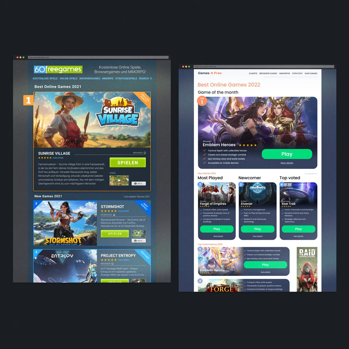
One of the first redesigned comparison sites. The idea behind this project was to update the UI of an underperforming site and see if design could improve performance, moving away from a generic template and giving it a face that made sense for its audience.
I collaborated with the German company We Love X as a Product and UX/UI designer. Their business focus on building comparison websites for different products and services and each site follows a similar logic: ranking products, writing detailed reviews, and guiding users towards the websites of the companies being compared.
When I first joined the project, most of these websites were built on a very basic WordPress template. They worked, but visually they were uninspiring. My role was to redesign several of these platforms, improving the user experience, refining the visual language, and adapting the look and structure of each site to match the product category it represented. The goal was simple: make the sites clearer, more engaging, and ultimately more effective at converting visitors into users.
The first project I worked on was a password manager comparison site. Here the challenge was to find the right balance between simplicity and security. The design needed to feel straightforward and accessible while still conveying the trust and reliability expected from a product dealing with personal data.
From there I moved on to more ambitious redesigns, including a financial services comparison platform. In which the main objective was to build credibility. The site needed to feel less like a simple comparison tool and more like a broader financial information resource. We expanded the design to include additional editorial pages, financial content, and supporting material, allowing the comparison feature to feel like a natural part of a larger and more authoritative website.
Another particularly interesting project was the redesign of a dating services comparison platform. It was a category I was not initially familiar with, so user research became essential. Through testing and behavioural analysis I proposed a radical change in the visual direction, moving the site from a bright white interface to a dark background. The reasoning was simple: many users visit dating sites at night and often in private settings, and darker interfaces felt more discreet and comfortable. The tests supported this hypothesis and the redesign proved successful.
Alongside these projects, I also worked on comparison platforms related to online gaming, casinos, and other digital services. Each required its own tone and visual strategy while still maintaining a clear and efficient comparison structure.
We also created several sites entirely from scratch. Projects such as food delivery comparisons and mattress comparison platforms allowed us to design the experience from the ground up. These involved defining the UX structure, branding, iconography, information hierarchy, and reading flow from the beginning.
Across all these projects, the main objective was to transform a network of basic, template-driven websites into platforms that felt more engaging, trustworthy, and tailored to their subject matter. The redesigns improved usability, strengthened visual identity, and contributed to better positioning and higher conversion rates across the portfolio.
Over time, these improvements helped We Love X expand further into new comparison markets, building on a foundation of clearer design and stronger user experience.

The redesign focused on updating one of two sites ranking the same products, but aimed at different audiences. In this case, the target was more mature and more focused on desktop games. After the redesign, the site started performing better than its competitor.

The two resulting sites after the UX development. Even if they offered the same service, the redesigned experiences followed completely different visual directions. Similar structure, but different personalities shaped around their audiences.

User research showed that the financial services ranking site needed to feel more trustworthy and knowledgeable. We redesigned the UI to create a more credible experience and expanded it beyond the ranking, so it felt more like a complete finance website with a comparison tool inside it, rather than just the latter.

Since this was not a category I knew closely, I had to rely completely on research for this project. User research showed that people felt more comfortable with a less bright and more discreet design, especially when browsing at night. So the dating platform moved from a bright white interface to a darker one.

A food services comparison site built from scratch. This gave us the chance to define the structure, visual style, reading flow and user experience from the beginning.

A closer look at the comparison logic. The layout was built to make options easier to scan, compare and act on, while creating a unique visual character to better sell the products presented.

All sites were prepared for scalability and for a better experience across different formats. The mobile versions kept the same structure and tone, adapted for smaller screens where most users would actually visit the sites.
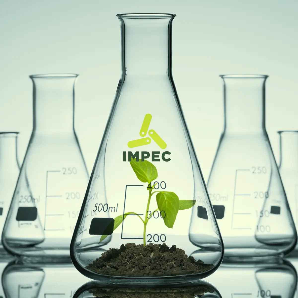

One of the main images I created for the new identity, mixing laboratory glassware with nature to represent IMPEC visually. It was used across several pieces and company communications.
IMPEC is one of the first biotechnology companies in Argentina and is now expanding across Latin America, the United States and Europe. When they contacted me, the business had already grown far beyond its original wordmark. Like many small companies, the first logo had been created quickly at a copy shop without much thought, and over the years the founder had grown to dislike it more and more.
I was initially asked to redesign just the logo, but it quickly became clear to me that the company needed much more than that. I proposed creating a complete corporate identity that could better represent what IMPEC had become and support where it wanted to go next. The aim was not simply to make the company look more modern, but to give it a clear visual foundation for its next stage of growth.
The process began with a series of meetings to understand the company, its structure, market position, products and future plans. From there, I started a long process of research and experimentation around biotechnology, the company itself, and the ways similar businesses communicated science, nature, innovation and industrial production. This work led to three carefully developed identity proposals, each based on a different interpretation of what I had learnt during the research phase.
Together with the management team, we selected the direction that felt most aligned with the company’s ethos. After several rounds of adjustments, we arrived at the final logo and the main guidelines that would shape the rest of the brand. The green colour palette reinforced the company’s connection with nature, while the symbol brought together ideas of biology, regeneration and the reuse of resources. A clean and modern typeface helped communicate the technological side of the business and its ambition to continue growing into new markets.
With the main direction in place, we began the long process of restructuring the brand. The first phase focused on the corporate and office side, including business cards, stationery, letterheads, email templates, company communications and internal signage. These were the everyday elements that helped introduce the new identity within the company before expanding it into more complex applications.
The industrial side was a much larger challenge. We reviewed the existing processes, especially the way product labels were created and applied. Working closely with the management and production teams, I developed a flexible label system that could be edited and adapted directly on the production line while still following the visual guidelines. We refined this process over several months until the designs worked correctly with the company’s systems, technical requirements and the national and international regulations governing the chemical products it supplied.
The final phase focused on the company’s external communication. Brochures, technical sheets and the website were redesigned to give IMPEC a complete and consistent way to present itself. Each piece needed to explain complex products clearly while reinforcing the same identity and creating a structure that could continue growing with the company.
What began as a logo redesign became a complete reorganisation of how IMPEC presented itself, from the office to the production line and out into the market. The result was a more coherent, modern and flexible brand, built to support a biotechnology company preparing for a much bigger future.

The original wordmark next to the new identity. The request to redesign the logo ended up becoming the starting point for restructuring the whole brand.

The three proposals I presented to the management team after the research process. Each one explored a different idea of how to express biotechnology through a symbol.

Working with feedback from the stakeholders, I finalised the new direction. We also discussed extensively whether to add a tagline that could help explain and further position the brand to new and potential clients.

Two variations of the business cards created for different people in the company. Being a company with highly technical expertise also meant having a wide range of titles, names and other important information that needed to be structured and brought into order.

The stationery system included an official letterhead used for corporate communications, a more technical version with all the company information at the top so it was easier to access, envelopes and a small lock-up used on plaques and email signatures.

The new label system applied to one of the company’s chemical products. The main challenge was fitting all the technical, safety and regulatory information while keeping the new identity clear.

The first main corporate brochure, bringing together information about the company, its services and products using the new visual language.

One of the many information-heavy documents I redesigned that still needed to remain clear, practical and consistent with the rest of the brand. This was later expanded into a set of ready-to-use templates that could be quickly adapted by non-design-savvy personnel.

The redesigned website on desktop, here showing the homepage and one of the internal pages. It brought the new identity online and gave the company a clearer way to explain what it does.

The mobile version of the website, showing the same content adapted to smaller screens, including the navigation and drop-down menu.
I’m an Art Director based in Barcelona with a background in Advertising, Branding, Product Design and Visual Storytelling all over the world. For years, I’ve led and shaped creative projects across Marketing, Graphic Design and Communication, crafting bold and coherent visual identities that connect for the most part, with people.
My approach combines strategic thinking with an eye for detail, ensuring every project is not only visually striking but also meaningful and aligned with its goals. I draw on my experience in design, code and data to bring clarity, beauty and purpose to everything I work on.
I’m passionate about guiding ideas from concept to execution, building brands and products that resonate with people, and also collaborating with teams to make work that gets results and leaves a lasting impression.
When I’m not doing that, I’m an involved parent of two kids and an involved partner of one spouse (their mum).
BA in Graphic Design
Master’s in Big Data & Data Science
Australian Management Diploma